📆 2025-11-23
Analysis of U-Boat attacks in WWII
⌛ Reading time: 13 minThe uboat attack dataset is an interesting dataset to explore. It contains records of over a thousand German U-Boat submarines and their activities during WWII. It contains not only data about themselves, but about their operational activities including the number of ships they sunk, tonnage sunk and number of human fatalities. It also includes details of the U-Boat commanders and the time periods they were active, and more.
Because this is a blog post on the internet and readers won't know me personally, I feel a need to state that my analysis of the German U-Boat attack data from WWII is in no way any commentary, like or dislike of Germany at that time, now or about any of the commanders personally. It is simply an analysis of an interesting dataset that contains events and allows for exploration in a variety of ways including temporal and geospatial.
In this post, we will explore this dataset using the r programming language and the ggplot library. I am a huge fan of ggplot. This post is an extension of research I previously undertook which can be found in my old github repo.
The data
The data can be found at this github repository. The data at that repo was originally obtained from Uboat.net.
For this analysis, we will be utilising both of the main tables, being:
uboat-data.csvuboat-targets-data.csv
Together, we can combine data about the U-Boats themselves, with data about each attack.
Getting started
Firstly, here are the libraries used for this analysis.
library(tidyr)
library(stringr)
library(maps)
library(scales)
library(tidyr)
library(lubridate)
library(dplyr)
library(ggplot2)
library(gridExtra)
Then, loading the data is simple.
ub <- read.csv("uboat-data.csv")
ubtgt <- read.csv("uboat-target-data.csv")
Let's have a quick look at the uboat data, focusing on the coordinates.
ub |>
    select(name, fate_lat, fat_lon) |>
    head(10)
| name | fate_lat | fat_lon |
|---|---|---|
| U-1 | 54.14 | 5.07 |
| U-2 | 54.48 | 19.55 |
| U-3 | ||
| U-4 | ||
| U-5 | 54.4 | 19.45 |
| U-6 | ||
| U-7 | 54.52 | 19.29 |
| U-8 | ||
| U-9 | 44.1 | 28.41 |
| U-10 |
And the same with the uboat attack data.
ubtgt |>
    select(name, attack_lat, attack_lo) |>
    head()
| name | attack_lat | attack_lo |
|---|---|---|
| U-3 | 57.39 | 7.48 |
| U-3 | 57.27 | 7.55 |
| U-4 | NA | NA |
| U-4 | 58.15 | 11.00 |
| U-4 | 58.40 | 9.52 |
| U-4 | 59.09 | 5.11 |
| U-7 | 60.07 | 4.37 |
| U-7 | 60.15 | 4.41 |
| U-9 | 54.00 | 3.40 |
| U-9 | 54.16 | 3.30 |
Looking at the outputs, we can see that the geospatial coordinate data is not too sparse, so could make an interesting element to explore later. I did not explore this dataset geospatially at all in my previous analysis of this data so this is something I am interested in doing this time around.
I know from previous experience, that this dataset is messy in parts, particularly in regards to the dates and times. I won't go into detail in the explanation here, but for those interested, the code and comments included in the code below will explain the issues and the logic.
ub$ordered = as.Date(ub$ordered, format = "%m/%d/%Y")
ub$ordered = as.Date(ifelse(ub$ordered < "1900-01-01", format(ub$ordered, "19%y-%m-%d"), format(ub$ordered)))

# laid_down
ub$laid_down = as.Date(ub$laid_down, format = "%m/%d/%Y")
ub$laid_down = as.Date(ifelse(ub$laid_down < "1900-01-01", format(ub$laid_down, "19%y-%m-%d"), format(ub$laid_down)))

# commissioned
ub$commissioned = as.Date(ub$commissioned, format = "%m/%d/%Y")
ub$commissioned = as.Date(ifelse(ub$commissioned < "1900-01-01", format(ub$commissioned, "19%y-%m-%d"), format(ub$commissioned)))

# launched
ub$launched = as.Date(ub$launched, format = "%m/%d/%Y")
ub$launched = as.Date(ifelse(ub$launched < "1900-01-01", format(ub$launched, "19%y-%m-%d"), format(ub$launched)))

# fate
ub$fate = as.Date(ub$fate, format = "%m/%d/%Y")
ub$fate = as.Date(ifelse(ub$fate < "1900-01-01", format(ub$fate, "19%y-%m-%d"), format(ub$fate)))

# also for ubtgt for attack_date variable
ubtgt$attack_date = as.Date(ubtgt$attack_date, format = "%m/%d/%Y")
ubtgt$attack_date = as.Date(ifelse(ubtgt$attack_date < "1900-01-01", format(ubtgt$attack_date, "19%y-%m-%d"), format(ubtgt$attack_date)))

# TIMES=========================

# Note that time is linked to a date. so we need to link the attack_time variable to the attack_date variable
# so we'll combine those columns
# BUT. Even before that, note we have notation for AM and PM. parsing dates won't recognise that.
# SO, we need to separate that data out into a separate column so we can fix the dates later.
# ALSO, some of the observations do not have entries for attack_time so these will be empty or have weird values

# The separates (using tidyr) the AM and PM out from the attack_time variable
# the AM and PM will be in a new variable called 'when'
ubtgt = ubtgt |>
  separate(attack_time, c('attack_timez', 'when'), sep=" ")

# Combine date and time columns into one (so we can relate the time to a date)
ubtgt$dateandtime <- as.character(paste(ubtgt$attack_date, ubtgt$attack_timez, sep = ' '))

# Then format the new variable to include date and time using as.POSIXct
ubtgt$dateandtime = as.POSIXct(ubtgt$dateandtime, format = "%Y-%m-%d %H.%M.%S")

# now we need to add 12hrs to the time column if the 'when' column has PM
# adding 12hrs involves using 12 * 60 * 60 to the time column

# This is how we add 12hrs need to multiply 60 seconds and 60 minutes and 12 hours
hourz = 12 * 60 * 60

# this is basically an if statement.
# if the 'when' column is "PM" and the dateandtime column is not NA, add hourz to dateandtime
ubtgt$dateandtime[ubtgt$when == "PM" & !is.na(ubtgt$dateandtime)] = ubtgt$dateandtime[ubtgt$when == "PM" & !is.na(ubtgt$dateandtime)] + hourz
# note because the times were formatted according to AM and PM, when adding 12 hours for only PM...
# we'll never need to worry about going past midnight and into the next day which would affect time.

# NAs===================
# We also want to deal with NA entries for number where we want to do calculations.
# We don't want erroneous errors that may not be evident. So we'll change NA values to zero
ubtgt$dead[is.na(ubtgt$dead)] = 0
ubtgt$complement[is.na(ubtgt$complement)] = 0
This is not all of the cleaning we could (should?) do, but it's good enough to get going for now.
Overall attacks over time
We'll kick off the analysis by looking at counts of events over time, which I always think is the best way to start an analysis with this sort of event data. And as you'll be able to see, I am more of a tidyverse type, than a base r type - unless I'm doing something like regression analysis and want to use a bunch of built-in tools for more rapid analysis.
ubtgt |>
    group_by(month = floor_date(dateandtime, "month")) |>
    summarize(cc = n()) |>
    ggplot(aes(month, cc)) +
    geom_bar(stat = 'identity', fill = "#ebbcba") +
    scale_x_date(date_breaks = "1 year", date_labels = "%Y") +
    ylim(c(0,150)) +
    labs(title = "Number of U-Boat attacks in WWII over time",
         subtitle = "Number of attacks summarised by month",
         caption = "Plot by adenoz\nData from https://github.com/kadenhendron/uboat-data",
         x = "Time",
         y = "Count of attacks") +
    adenoz_theme  # this is my theme for this blog
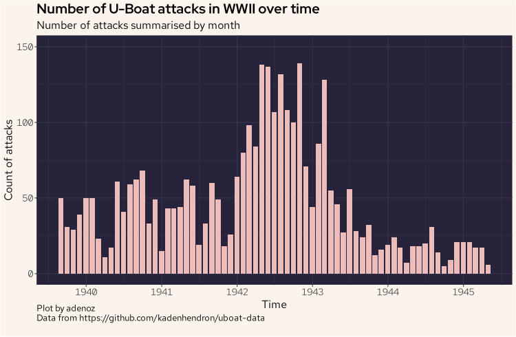
There is nothing too surprising here right away, but we now have a reference point as we start to dive into the data more. We can see thing really start to ramp up from around 1942. Let's keep going.
The next plot is also a barplot, but this one is showing the sum of total tonnage sunk, by the nationality of the sunk ships, considering only the top five nationalities of ships sunk by the total count. The intent with this plot is to see what ships the U-Boats seemed to target the most, by summing the total tonnage, and how this may have evolved over time. So we are considering the top five nationalities by the count of attacks they received, but from that list, we are summing the tonnage sunk.
most_sunk = ubtgt |>
    count(nationality) |>
    arrange(desc(n)) |>
    head(5)
ubtgt |>
    filter(nationality == most_sunk[1:5,1]) |>
    filter(loss_type == "Sunk") |>
    group_by(month = floor_date(dateandtime, "month"), nationality) |>
    summarize(tonz = sum(tonnage)) |>
    ggplot(aes(month, tonz, group = nationality, fill = nationality)) +
    geom_bar(stat = 'identity') +
    scale_x_date(date_breaks = "1 year", date_labels = "%Y") +
    scale_fill_manual(values = c("#eb6f92", "#f6c177", "#9ccfd8", "#f2e9e1", "#c4a7e7")) +
    labs(title = "Barplot showing sum of tonnage sunk over time",
         subtitle = "Grouped by nationalities targeted",
         caption = "Plot by adenoz\nData from https://github.com/kadenhendron/uboat-data",
         x = "Time",
         y = "Tonnage sunk in total each month, by nationality") +
    adenoz_theme
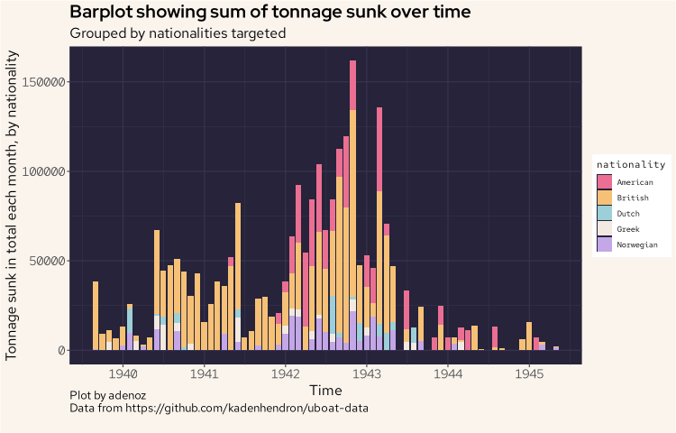
This is getting more interesting. Right away we can see that British shipping has the largest tonnage lost to uboat attacks, even generally after the US entered the war and started getting targeted by the uboats from around 1942. The other nationalities don't really compare, and we are highlighting the next most targeted after the British and American ships.
Manufacturing vs losses
Before moving on to developing a couple of additional variables, we'll quickly see if there are any interesting trends or insights by comparing the count of uboat launches with the count of uboats being sunk and see if there was any capacity issues at any time during the war.
# uboats sunk
sunk_time = ub |>
  filter(fate_type == "Sunk") |>
  group_by(month=floor_date(fate, "month")) |>
  summarize(count = n())

# uboats launched
launched_time = ub |>
  group_by(month=floor_date(launched, "month")) |>
  summarize(count = n())

# combine, and filter to just from 1940
compare <- launched_time |>
    left_join(sunk_time, by = "month") |>
    filter(month > "1940-01-01")

ggplot(compare, aes(x = month)) +
    geom_line(aes(y = count.x), color = "#9ccfd8", linewidth = 1) +
    geom_line(aes(y = count.y), color = "#eb6f92", linewidth = 1) +
    scale_x_date(date_breaks = "1 year", date_labels = "%Y") +
    annotate("text", x = as.Date("1944-10-01"), y = 34, label = "Launched", cex = 5, color = "#9ccfd8") +
    annotate("text", x = as.Date("1944-10-01"), y = 3.6, label = "Sunk", cex = 5, color = "#eb6f92") +
    labs(title = "Comparing U-Boat launches vs sinkings over time",
         subtitle = "Searching for potential production pressure",
         caption = "Plot by adenoz\nData from https://github.com/kadenhendron/uboat-data",
         x = "Months",
         y = "Count of occurances, per month") +
    adenoz_theme
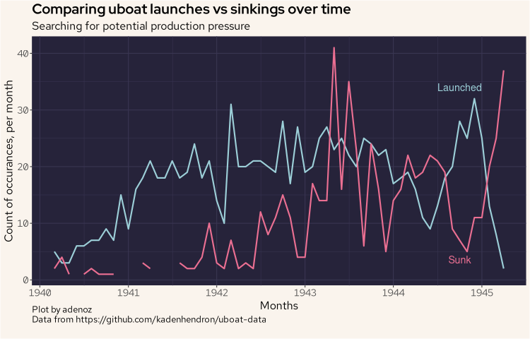
In the above plot, we can see that until 1943 there wasn't a lot of pressure on the uboat fleet. Then by the end of that year, they were tending to lose more uboats than they were launching.
Basic feature generation
Now may be a good time to quickly generate a new variable that we'll call lethality, which will be a ratio of the number of killed over the total complement on the ships sunk. If 200 people were killed in an attack on a ship that had a complement of 400 personnel, the lethality score will be 0.5. If all 400 were killed, that would be a lethality of 1 and if none were killed, that would be a lethality of 0.
ubtgt = ubtgt |>
    mutate(lethality = round(dead / complement, 2))
ubtgt$lethality[is.nan(ubtgt$lethality)] = 0
We'll now plot the distribution of the lethality score.
ubtgt |>
    ggplot(aes(lethality)) +
    geom_histogram(col = "#ebbcba", fill = "#ebbcba") +
    labs(title = "Histogram of lethality score",
         subtitle = "Lethality scored from 1 (totally lethal) to 0 (not lethal)",
         caption = "Plot by adenoz\nData from https://github.com/kadenhendron/uboat-data",
         x = "Lethality score",
         y = "Count within bucket") +
    adenoz_theme
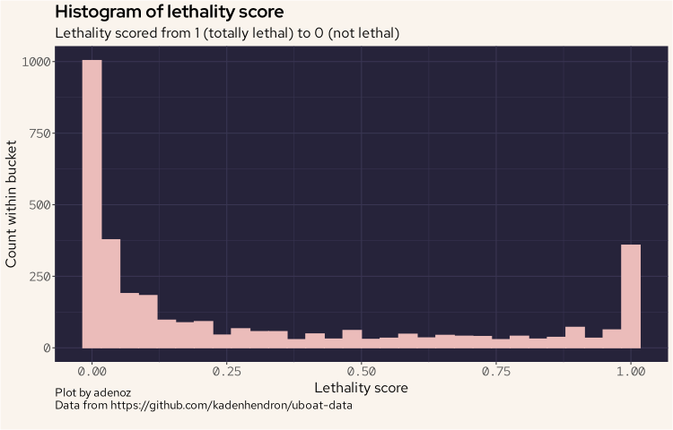
And we can see that the distribution is a little unusual, as we see lots of very low scores, but also a high point at the highest end. That is interesting, so we must have a number of cases where attacks tended to be quite devastating resulting in a loss of all crew.
While we are thinking of different data that may be interesting to explore, it may also be interesting to compare attacks conducted at different times of day. There may be interesting insights here to understand how uboats operated.
ubtgt = ubtgt |>
    mutate(day_period = case_when(
        hour(dateandtime) < 6 ~ "small_hours",
        hour(dateandtime) < 8 ~ "sunrise",
        hour(dateandtime) < 11 ~ "morning",
        hour(dateandtime) < 13 ~ "midday",
        hour(dateandtime) < 16 ~ "afternoon",
        hour(dateandtime) < 20 ~ "sunset",
        hour(dateandtime) < 24 ~ "evening",
        TRUE ~ "nil"
    ))
ubtgt |>
    count(day_period) |>
    arrange(desc(n))
| day_period | n |
|---|---|
| small_hours | 927 |
| evening | 657 |
| sunset | 440 |
| morning | 363 |
| sunrise | 294 |
| midday | 282 |
| afternoon | 277 |
| nil | 218 |
We have sorted the above output by the count of what time period of the day uboats attacks the most. It would seem that, perhaps not suprisingly, uboats were night hunters.
We can plot this as well for a more visual look, and lay out the day periods in their natural order.
ubtgt |>
   mutate(day_period = factor(day_period, levels = c("small_hours", "sunrise", "morning", "midday", "afternoon", "sunset", "evening", "nil"))) |>
   count(day_period) |>
   arrange(desc(n)) |>
   ggplot(aes(day_period, n)) +
   geom_bar(stat = 'identity', col = "#ebbcba", fill = "#ebbcba") +
   labs(title = "Barplot showing attacks, by time of day",
        subtitle = "For all U-Boat attacks during WWII",
        caption = "Plot by adenoz\nData from https://github.com/kadenhendron/uboat-data",
        x = "Time period of day",
        y = "Count of attacks") +
   theme(axis.text.x = element_text(angle = -30, vjust = 1, hjust = 0)) +
   adenoz_theme
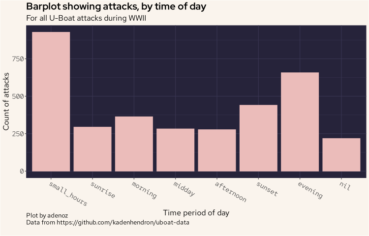
And we can see the pattern of attacks mostly, though not always, tending to attack at night.
Commander analysis
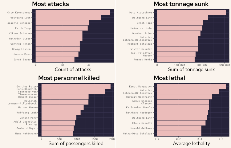
Now, we'll move on to see if we can identify the most capable uboat commanders. Such commanders, if we can identify them, would justify additional effort to locate and disrupt their efforts (if we were conducting this analysis during WWII). There are a few different approaches we could use to identify the most capable commanders however there is no definitely correct answer. It will depend on what subject matter experts would consider the most important. Is it the number of attacks? The total tonnage sunk? The most personnel killed? Their lethality?
What we will do to get a lot of information all together, is plot four graphs all in the one output, and try to make it fit nicely so that we can look at lots of sorted metrics close to one another. There is a bit of code here, and some additional theme configuration to make some elements smaller than our normal settings so that we can fit some of the text and axis details.
Note that for the lethality ratio, because it would be fairly easy to score highly with one attack that may have killed 5 out of 5 personnel, we’ve filtered this plot to only include commanders who conducted more than 15 attacks. This filter allows us to ensure we are only capturing skilled consistent lethality and not a one-off fluke.
# most attacks
comd_attacks = ubtgt |>
    count(commander) |>
    arrange(desc(n)) |>
    head(10) |>
    arrange(n)

# most tonnage
most_tonnage = ubtgt |>
    group_by(commander) |>
    filter(loss_type == "Sunk") |>
    summarize(tonnagez = sum(tonnage)) |>
    arrange(desc(tonnagez)) |>
    head(10) |>
    arrange(tonnagez)

# most kills
most_killed = ubtgt |>
    group_by(commander) |>
    summarize(killed = sum(dead)) |>
    arrange(desc(killed)) |>
    head(10) |>
    arrange(killed)

# commanders with at least n attacks
five_attacks = ubtgt |>
    count(commander) |>
    filter(n > 15)

# mean of lethality
most_lethal = ubtgt |>
    filter(lethality < 1.1) |>
    group_by(commander) |>
    summarize(lethal = mean(lethality))

# left join lethality onto at least n
five = five_attacks |>
    left_join(most_lethal, by = "commander") |>
    arrange(desc(lethal)) |>
    head(10) |>
    arrange(lethal)

f1 <- ggplot(comd_attacks, aes(reorder(commander, n), n)) +
    geom_bar(stat = 'identity', fill = "#ebbcba", col = "#ebbcba") +
    scale_x_discrete(labels = label_wrap(20)) +
    coord_flip() +
    labs(title = "Most attacks",
         x = "",
         y = "Count of attacks") +
    theme(axis.text.y = element_text(size = 8)) +
    theme(axis.text.x = element_text(size = 8)) +
    adenoz_theme

f2 <- ggplot(most_tonnage, aes(reorder(commander, tonnagez), tonnagez)) +
    geom_bar(stat = 'identity', fill = "#ebbcba", col = "#ebbcba") +
    scale_x_discrete(labels = label_wrap(20)) +
    scale_y_continuous(labels = scales::comma) + # Format y-axis labels with commas
    coord_flip() +
    labs(title = "Most tonnage sunk",
         x = "",
         y = "Sum of tonnage sunk") +
    theme(axis.text.y = element_text(size = 8),
          axis.text.x = element_text(size = 8)) +
    adenoz_theme

f3 <- ggplot(most_killed, aes(reorder(commander, killed), killed)) +
    geom_bar(stat = 'identity', fill = "#ebbcba", col = "#ebbcba") +
    scale_x_discrete(labels = label_wrap(20)) +
    coord_flip() +
    labs(title = "Most personnel killed",
         x = "",
         y = "Sum of passengers killed") +
    theme(axis.text.y = element_text(size = 8),
          axis.text.x = element_text(size = 8)) +
    adenoz_theme

f4 <- ggplot(five, aes(reorder(commander, lethal), lethal)) +
    geom_bar(stat = 'identity', fill = "#ebbcba", col = "#ebbcba") +
    scale_x_discrete(labels = label_wrap(20)) +
    coord_flip() +
    labs(title = "Most lethal",
         x = "",
         y = "Average lethality") +
    theme(axis.text.y = element_text(size = 8)) +
    theme(axis.text.x = element_text(size = 8)) +
    adenoz_theme

# start plotting
grid.arrange(f1, f2, f3, f4, ncol = 2)
Plot by adenoz
Data from https://github.com/kadenhendron/uboat-data
And the above plot shows us some interesting detail about the various strengths and capabilities of uboat commanders. From the above we can see that Otto Kretschmer appeared to be a very effective uboat commander. Not only did he conduct the most attacks he also sunk the most tonnage, by some margin. Wolfgang Luth was second for both the number of attacks and tonnage sunk. Erich Topp was the next most effective commander by these two metrics. Gunther Prien killed the most personnel, followed by Hans-Diedrich Freiherr von Tiesenhausen. These two killed the most personnel by some margin. Gunther Prien is noteworthy for featuring in three of the four plots.
Remember that the most lethal plot only includes commanders who conducted more than 15 attacks. Hein-rich Lehmann-Willenbrock featured not only the second highest for most lethal, but also fourth for the most personnel killed and sixth for most tonnage sunk. He is one of the few commanders who featured on at least three of these plots.
Wolfgang Luth is the standout here as he is the only commander to feature in all four plots and as high as second in two plots, behind Otto Kretschmer. So we'll have a look at Luth in a little more detail next.
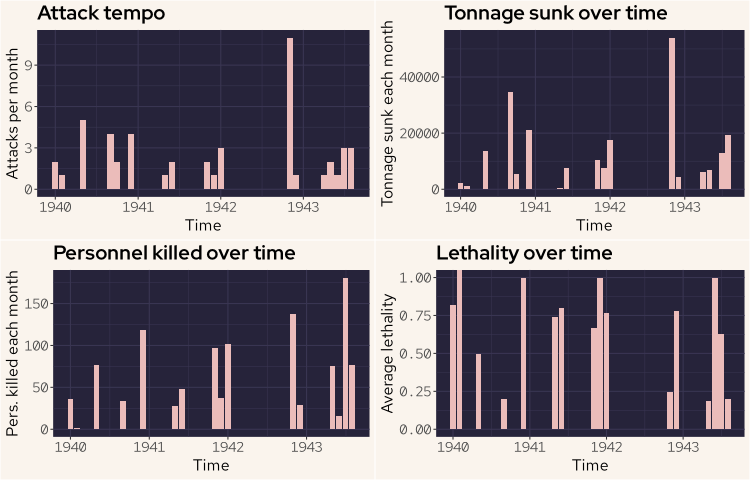
Wolfgang Luth
Let’s now take a closer look at Wolfgang Luth to see if we can better understand his activies and modus operandi.
f1 <- ubtgt |>
    filter(commander == "Wolfgang Luth") |>
    group_by(month=floor_date(dateandtime, "month")) |>
    count(month) |>
    ggplot(aes(month, n)) +
    geom_bar(stat = 'identity', fill = "#ebbcba") +
    labs(title = "Attack tempo",
         x = "Time",
         y = "Attacks per month") +
    adenoz_theme

f2 <- ubtgt |>
    filter(commander == "Wolfgang Luth" & loss_type == "Sunk") |>
    group_by(month=floor_date(dateandtime, "month")) |>
    summarize(tonnz = sum(tonnage)) |>
    ggplot(aes(month, tonnz)) +
    geom_bar(stat = 'identity', fill = "#ebbcba") +
    labs(title = "Tonnage sunk over time",
         x = "Time",
         y = "Tonnage sunk each month") +
    adenoz_theme

f3 <- ubtgt |>
    filter(commander == "Wolfgang Luth" & loss_type == "Sunk") |>
    group_by(month=floor_date(dateandtime, "month")) |>
    summarize(killed = sum(dead)) |>
    ggplot(aes(month, killed)) +
    geom_bar(stat = 'identity', fill = "#ebbcba") +
    labs(title = "Personnel killed over time",
         x = "Time",
         y = "Pers. killed each month") +
    adenoz_theme

f4 <- ubtgt |>
    filter(commander == "Wolfgang Luth" & loss_type == "Sunk") |>
    group_by(month=floor_date(dateandtime, "month")) |>
    summarize(lethal = mean(lethality)) |>
    ggplot(aes(month, lethal)) +
    geom_bar(stat = 'identity', fill = "#ebbcba") +
    labs(title = "Lethality over time",
         x = "Time",
         y = "Average lethality") +
    adenoz_theme

grid.arrange(f1, f2, f3, f4, ncol = 2)
Plot by adenoz
Data from https://github.com/kadenhendron/uboat-data
The attack tempo plot shows simply the number of attacks conducted each month. The tonnage sunk plot shows the sum of tonnage sunk for each month. The personnel killed plot also sums the personnel killed for each month. The lethality plot contains the mean average of the lethality rate for each month.
There are some significant gaps in the activities of Wolfgang Luth, likely between times being away on patrol. There is about an eleven month gap between Jan 1942 and Nov 1942. However in Nov Wolfgang conducted over 10 attacks that month, all resulting in the targets being sunk. The lethality ratios for these individual attacks ranged from zero to 0.83 (note the plot for lethality is monthly mean values for lethality).
We'll now have a quick look at what times of the day Luth may have preferred to conduct his attacks.
ubtgt |>
    filter(commander == "Wolfgang Luth") |>
    count(day_period) |>
    ggplot(aes(reorder(day_period, n), n)) +
    geom_bar(stat = 'identity', fill = "#ebbcba") +
    coord_flip() +
    labs(title = "Wolfgang Luth preferred attack times",
         subtitle = "Count of attacks by period of day",
         caption = "Plot by adenoz\nData from https://github.com/kadenhendron/uboat-data",
         x = "Day period",
         y = "Count") +
    adenoz_theme
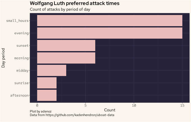
And we can see that clearly, Luth was a night hunter.
Geospatial analysis
We'll now move on to displaying the locations of the fates of all U-Boats throughout the war. We'll start by simply plotting all of the end fate locations for all uboats throughout the war. We do need to tidy up the coordinate data, which is in string format and includes additional characters that need removing before we can cast as double.
wd <- map_data("world")

fatez <- ub |>
    filter(grepl("[0-9]", fate_lat)) |>
    mutate(fate_lat = str_replace_all(fate_lat, '\\"', ""),
           fat_lon = str_replace_all(fat_lon, '\\"', "")) |>
    mutate(fate_lat = as.double(fate_lat),
           fat_lon = as.double(fat_lon))

ggplot(wd, aes(long, lat)) +
  geom_polygon(aes(group = group), fill = "#908caa", col = "#393552", show.legend = FALSE) +
  geom_point(data = fatez, aes(fat_lon, fate_lat), col = "#eb6f92") +
  labs(title = "Locations of U-Boat fate through WWII",
       subtitle = "U-Boat activity spanned much of the globe",
       caption = "Plot by adenoz\nData from https://github.com/kadenhendron/uboat-data",
       x = "Longitude",
       y = "Latitude") +
  adenoz_theme

From the above plot, we can see that U-Boats travelled far and wide, ending up well into the Indian ocean and beyond, on the other side of the world. Through my research I did some digging into some of the uboats and there is some fascinating history and stories around some of these boats.
Let's now look at the fate locations by the fate type.
ggplot(wd, aes(long, lat)) +
  geom_polygon(aes(group = group), fill = "#908caa", col = "#393552", show.legend = FALSE) +
  geom_point(data = fatez, aes(fat_lon, fate_lat), col = "#eb6f92") +
  facet_wrap(~fate_type) +
  labs(title = "Locations of U-Boat fate, by fate type",
       subtitle = "Most U-Boats were sunk, often far from home",
       caption = "Plot by adenoz\nData from https://github.com/kadenhendron/uboat-data",
       x = "Longitute",
       y = "Latitude") +
  adenoz_theme
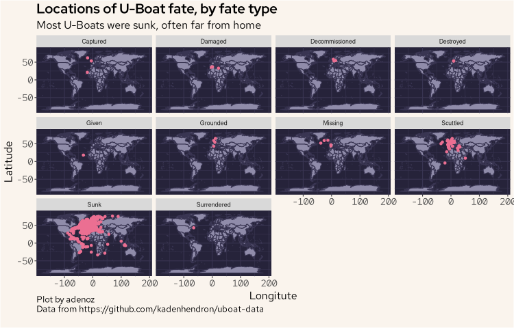
We can see here that by far, most uboats were sunk and were often sunk far from their home waters.
Let's now look at the fate locations over time, by year.
ggplot(wd, aes(long, lat)) +
  geom_polygon(aes(group = group), fill = "#908caa", col = "#393552", show.legend = FALSE) +
  geom_point(data = fatez, aes(fat_lon, fate_lat), col = "#eb6f92") +
  facet_wrap(~year(fate)) +
  labs(title = "Locations of U-Boat fate, by year",
       subtitle = "U-Boat activity spread significantly 1942-1944, then retreated in 1945",
       caption = "Plot by adenoz\nData from https://github.com/kadenhendron/uboat-data",
       x = "Longitude",
       y = "Latitude") +
  adenoz_theme
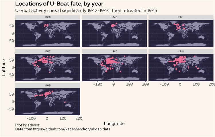
The activities of uboats spread significantly from 1942 which saw the venture over to the American coastline as well around the southern tip of Africa and into the Indian ocean region, getting quite close to Australia. That is a long way from home.
I did look at the attack dataset which did contain geolocation data for each attack, however the data seemed to be quite poor, with many locations being over land with large clusters in areas where they did not frequent in such numbers, so I will not display those plots here. It's a little dissapointing as I was particularly interested in exploring how and where the uboats conducted attacks over time. But alas, data quality. I could seek to manually harvest my own uboat attack dataset, but that is beyond the scope of this blog post. I may look to explore this in the future. Or not.
Final timeline plot
To finish of this little exploratory analysis of the uboat dataset, we'll display all of the main temporal milestones for all of the uboats from just one type of uboat. The focus on just one type is a practical consideration as displaying a static plot that is very tall is not ideal. I'll aim to build this plot on an interesting uboat type. So as a preliminary step, we'll quickly look at what uboat types conducted the most attacks.
ub |>
    group_by(type) |>
    summarize(sunk = sum(ships_sunk)) |>
    arrange(desc(sunk)) |>
    head(10) |>
    ggplot(aes(reorder(type, sunk), sunk)) +
    geom_bar(stat = 'identity', fill = "#ebbcba") +
    coord_flip() +
    labs(title = "U-Boat types that conducted the most attacks",
         caption = "Plot by adenoz\nData from https://github.com/kadenhendron/uboat-data",
         x = "U-Boat types",
         y = "Count of attacks conducted") +
    adenoz_theme
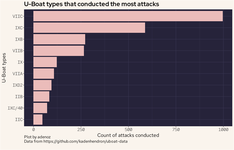
And we can see the VIIC type conducted the most attacks. However, when I went to plot this type, there were too many to list vertically. So, we'll use the next type, being the IXC which conducted the second most number of attacks.
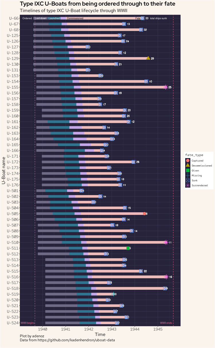
Now, let's build our last plot. This final plot shows all uboats of the IXC type, showing the full lifecycle of all of the IXC uboats from being ordered through to their final fate, including the fate type. The plot also shows the total sum of all ships each IXC uboat sunk. This plot took by far the longest to produce and tweak to get it looking just how I wanted. It is also the plot I learnt the most about as I have not attempted this sort of plot before, nor have I used the geom_segment() function in ggplot2 before. I was also somewhat inspired by this post (not https).
Let's go.
ub |>
    filter(type == "IXC") |>
    mutate(nn_ordered = ordered,
           nn_laid = laid_down,
           nn_launch = launched,
           nn_comm = commissioned,
           nn_fate = fate) |>
    pivot_longer(
      cols = starts_with("nn_"),
      names_to = "time",
      values_to = "value"
    ) |>
    ggplot(aes(value, reorder(name, -id), fill = time)) +
    geom_segment(aes(x = ordered, xend = laid_down, yend = reorder(name, -id)), colour = "#6e6a86", size = 4) +
    geom_segment(aes(x = laid_down, xend = launched, yend = reorder(name, -id)), colour = "#31748f", size = 4) +
    geom_segment(aes(x = commissioned, xend = fate, yend = reorder(name, -id)), colour = "#ebbcba", lineend = "round", size = 4) +
    geom_segment(aes(x = launched, xend = commissioned, yend = reorder(name, -id)), colour = "#c4a7e7", size = 4) +
    geom_point(aes(fate, name,col = fate_type, shape = fate_type), size = 5) +
    scale_x_date(date_breaks = "1 year", date_labels = "%Y") +
    geom_text(aes(fate, name, col = ships_sunk, label = ships_sunk), hjust = -1, color = "white", size = 3) +
    guides(fill = "none") +
    geom_vline(aes(xintercept = as.Date("1939-09-01")), lty = 2, col = "#eb6f92") +
    geom_vline(aes(xintercept = as.Date("1945-09-02")), lty = 2, col = "#eb6f92") +
    annotate("text", x = as.Date("1939-05-01"), y = "U-66", label = "Ordered", col = "white", cex = 3) +
    annotate("text", x = as.Date("1939-12-01"), y = "U-66", label = "Laid down", col = "white", cex = 3) +
    annotate("text", x = as.Date("1940-07-04"), y = "U-66", label = "Launched", col = "white", cex = 3) +
    annotate("text", x = as.Date("1941-06-01"), y = "U-66", label = "Commissioned", col = "black", cex = 3) +
    annotate("text", x = as.Date("1944-02-20"), y = "U-66", label = "Fate", col = "black", cex = 3) +
    annotate("text", x = as.Date("1945-01-10"), y = "U-66", label = "total ships sunk", col = "white", cex = 3) +
    annotate("text", x = as.Date("1939-05-10"), y = "U-524", label = "WWII begins", col = "#eb6f92", cex = 3) +
    annotate("text", x = as.Date("1945-05-10"), y = "U-524", label = "WWII ends", col = "#eb6f92", cex = 3) +
    labs(title = "Type IXC U-Boats from being ordered through to their fate",
         subtitle = "Timelines of type IXC U-Boat lifecycle through WWII",
         caption = "Plot by adenoz\nData from https://github.com/kadenhendron/uboat-data",
         x = "Time",
         y = "U-Boat name") +
    adenoz_theme
Thanks for dropping by, and I hope you found this post of interest.
📌 Post tags: r ggplot