📆 2025-10-30
Little internet speedtest data project
⌛ Reading time: 15 minHere is a nice little data project where we can monitor our internet speed over time, like every 30mins, and see how it performed over some arbitrary time period, like a fortnight or a month. And we get to play around with some nice technologies like nushell, duckdb, cron and r. Overall, I'm happy with my internet service, but this seemed like it would be a nice little interesting project.
Let's get cracking.
Here is the plan
- download the
speedtest-clipackage. - use
nushellto do things with the data thatspeedtest-clican provide. - learn how we can build a dataset, into a simple csv file in this case.
- build a
nushellscript and automate it withcron. - after a while, we'll graphically analyse the collected data to find out what's going on with our internet speed.
Let's get into it.
Speedtest-cli
First, download the speedtest-cli package via your package manager. You'll need to use whatever package manager you already use for your OS and / or preferences. For Fedora, which is what I am currently using:
sudo dnf install speedtest-cli
Then we can run it.
speedtest-cli
# or
speedtest-cli --simple  # for just a simple output
# or
speedtest-cli --json  # for ... json output
# or
speedtest-cli --csv  # for ... csv output
# or
speedtest-cli -h  # to see the help options
Here is what a one-off simple speedtest looks like in the terminal.
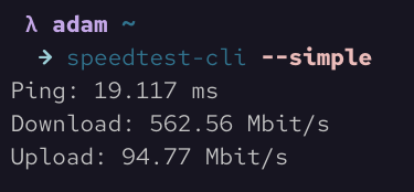
That's all good if we just want to run one-off ad-hoc speedtests, but what if we want to monitor our internet speed over time so that we can see times that tend to be slower, if your ISP isn't providing what you're paying for, or to validate your feelings that your service is generally pretty good?
Nushell
We won't go into how to install nushell here. It is pretty easy though. A quick search for the docs will give you what you need.
We can grab the outputs from any of the above commands and using nushell we can pipe them (using the | symbol) in various ways to get different outcomes. Let's have a look.
speedtest-cli --json | flatten  # which flattens out the slightly nested json structure
speedtest-cli --csv | save filename.csv  # this saves the output into a csv file as a single row / observation. No headers though.
speedtest-cli --csv-headers | save filename.csv  # this grabs just the headers.
speedtest-cli --csv | save filename.csv --append  # and this will append the single row
From those above outputs, we can build ourselves a nice little dataset of our internet speed over time.
We'll now build a simple nushell script that will run every x minutes and appends the data to a csv file each time. I would like to know when my internet speed is faster and when it is slower and see if there are any trends or patterns of note. Perhaps we'll run this script every 30mins or so.
#!/usr/bin/nu

# This script assumes a csv file with header has already been created.
# For example, via `speedtest-cli --csv-header | save st_data.csv`
# Remember, the script needs the full absolute path.

speedtest-cli ---csv | save /home/full/path/to/data/directory/st_data.csv --append
And that's all we need for this script. Nice and easy one. Note that we need to execute speedtest-cli --csv-header | save st_data.csv first to give us our csv file with headers. Make sure it is saved in the same location as specified in the nushell script.
Cron
Rather than needing to execute this script manually each time, we can automate this by utilising a cron job. Here is the crontab command.
crontab -e
# then,
13,43 * * * * /home/full/path/to/script/directory/speedtest.nu
Note, we are executing this every 30mins but we are executing at 13mins and 43mins past the hour, rather then just every 30mins on the hour and half hour. This is because I found that the script would often fail to execute. After some looking into it, it seems that this is a highly used service and it seems that these are peak times when systems tend to automate hitting this service, so they run out of capacity and jobs just fail. However, by setting the script to execute at those less standard times, the script almost always successfully runs.
Note also that the data and script do not need to be in the same directory.
For cron to be able to execute this script, we need to make it executable, by modifying the permisions.
chmod +x speedtest.nu
When first setting up the script, set up a much shorter time interval so you can monitor it and make sure it is executing and is adding a line to the csv file. Typical issues are not setting the absolute file path properly as well as not setting the +x permissions correctly. Once you have confirmed cron is executing the script as desired, set the times as above, or to your preferences.
Now, we sit back, go about our days and weeks and come back and have a look at our growing csv file to see what we have.
Now the fun part can begin.
The data
To begin, to quickly get a look at our data, we can use cat or bat, but neither of these are great for displaying structured data. And the speedtest-cli output generates just enough columns to be too wide for most terminal windows.
Before we move on to the main tools we'll be playing with today, we can have a look at the data via nushell. In fact, there is a lot we can do by continuing our use of nushell. One of the easiest things we can do right away is use the following command to give us a nice and quick look at our data:
open st_data.csv | first 10
That will provide a nice print out of our data in a nice table. We can also get a print out of the columns and data types it detects.
open st_data.csv | describe
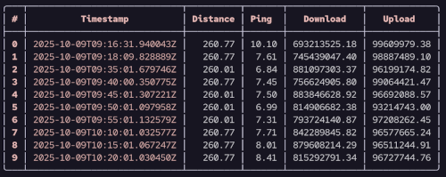
Here is an abridged print out omiting some more sensitive columns like server, IP and location data.
open st_data.csv | select Timestamp Distance Ping Download Upload | first 10
We can do many other things with the data, but we will pause using nushell for now and move on. But just note, we are not moving on because nushell can't do more. It can indeed, and we will explore nushell more in many other posts on this blog. But we'll now move on to duckdb.
DuckDB
Much like with nushell, we won't into installing duckdb, as it really is quite easy to follow the docs.
To get started using duckdb, we just enter the following:
duckdb
And then we enter the duckdb prompt where can start executing commands and interacting with data.
To start, it is often nice to get a sense of the data regarding the size, column names, data types and some summary statistics. To get cracking, it is useful to execute the following two commands.
DESCRIBE st_data.csv;
-- and
SUMMARIZE st_data.csv;
Here is the output following the DESCRIBE command.
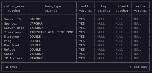
Note we can just access the data in csv form and read it. We don't need to define a table or schema first. Just start using it where it is. DuckDB has even detected data types well, including the Timestamp column. Nice.
Both of those outputs will provide the desired high level information. Depending on your internet speed and what data has been collected over time, hopefully your minimum Download speed isn't much below your expectations.
Next, it can be good to get a sense of the data by looking at just a bit of it. Even though this is only a very small dataset, it is good to run our eyes over part of it, similar to what we did with nushell.
SELECT *
FROM st_data.csv
ORDER BY Timestamp DESC
LIMIT 20;
Note again, we just read the csv file like a table name. And we can just use normal SQL. Very handy and nice.
Not bad. We can also start to look at some of the minimums and maximums in one place.
SELECT
  MIN(Download) AS min_dl,
  MAX(Download) AS max_dl,
  MIN(Ping) AS min_ping,
  MAX(Ping) AS max_ping
FROM st_data.csv;
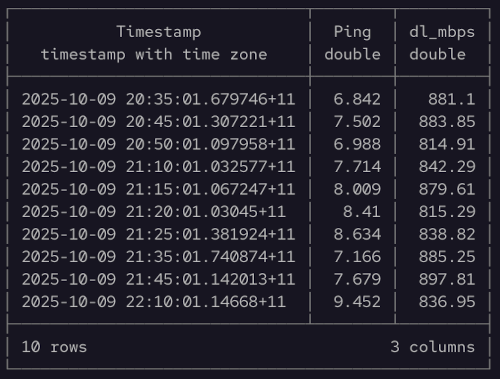
Let's now do some simple SQL processing to look at the data above a certain speed, in time order.
SELECT
  Timestamp,
  Ping,
  ROUND(Download / 1000000, 2) AS dl_mbps
FROM st_data.csv
WHERE dl_mbps > 800
ORDER BY Timestamp
LIMIT 10;
And here is the output from the last query.
We can even do some simple visualisations using duckdb too. This can be very handy to do before needing to move on to a more advanced graphical data analysis platform and tooling, like ggplot in r.
Let's look at a histogram of our download speeds to get a sense of the distribution. Yes, we can do this in the duckdb cli in the terminal.
SELECT *
FROM histogram(st_data.csv, Download);
And here is the output from the histogram query.
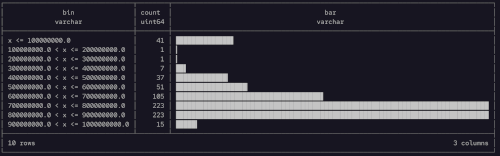
And just like that we can see the Download speed distribution. Very nice. That bump on the tail of low speeds is a little concerning. We'll definately want to explore that in more detail later. But at least the main distribution is at the upper end. We can do the same thing for upload speeds and pings too.
Furthermore, we can aggregate the Download speeds over time to see if there are any temporal trends. We'll finish up our section with duckdb by looking at the average Download speed by day.
SELECT
  time_bucket(INTERVAL 1 DAY, Timestamp) AS time,
  AVG(Download) AS number,
  bar(number,1000,1000000000)
FROM st_data.csv
GROUP BY ALL
ORDER BY time;
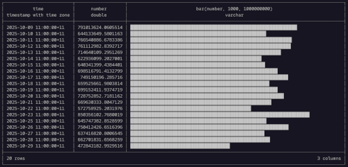
There is nothing that stands out too far from the above, with no obvious issues on any particular day of the week. But it might be interesting to look at different times of day to see if there is any difference between mornings and nights and the like, within each day. While we could do this sort of thing in duckdb, we might now move on to having a look with r. Again, much like moving on from nushell to duckdb, we could stay where we are, but we'll move on to the next tool - just for fun.
R
Now we pull out the heavy guns when it comes to graphical data analytics - R. In particular, we will be utilising the ggplot plotting library in R, which is arguably the gold standard, or at least benchmark, upon which all other plotting libraries are compared.
First, we'll use ggplot to build a histogram, similar to how we did for duckdb.
df |>
    mutate(DL = Download / 1000000) |>
    ggplot(aes(DL)) +
    geom_histogram(col = "#ebbcba", fill = "#ebbcba") +
    labs(title = "Histogram of download speeds",
         subtitle = "Seeking to understand the distribution of download speeds",
         caption = "Source: adenoz",
         x = "Download speeds (in Mbit/s)",
         y = "Count of download speeds") +
    adenoz_theme
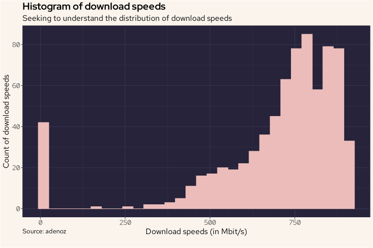
And we see basically the same shape, but oriented in the more traditional fasion. I've used a nice Rose Pine color scheme to match the style of this blog. Again, that bump of low speed recordings is something I want to understand more.
Also similar to what we did with duckdb, we'll now also plot the download readings over time using a line chart to see what it may tell us.
df |>
    group_by(hour = floor_date(Timestamp, "hour")) |>
    summarize(avg_dl = mean(Download / 1000000)) |>
    ggplot(aes(hour, avg_dl)) +
    geom_line(linewidth = 0.8, col = '#ebbcba') +
    labs(title = "Internet download speed over time, by hour",
         subtitle = "Looking for temporal trends or patterns in download speeds",
         caption = "Source: adenoz",
         x = "By hour, over time",
         y = "Average download speed, in Mbit/s") +
    adenoz_theme
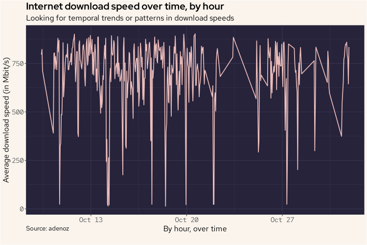
And again, there is nothing too weird going on here. There is no obvious pattern here, though we do see numerous lower readings spread out over time. Something that is now a little more apparent than when we used duckdb is that there seems to be a gap in readings around the 23/24 Oct. Looking back at the duckdb bar plot, we can see that duckdb skipped readings for the 24th. In ggplot here, that gap is included in the output whereas duckdb just didn't include a reading at all.
While there is nothing that stands out too much regarding temporal download readings, it might be worth exploring if there are differences within each day over different periods of each day, like comparing mornings to evenings. We break up the day with the following code.
df = df |>
  mutate(day_period = case_when(
    hour(Timestamp) < 6 ~ "small_hours",
    hour(Timestamp) < 8 ~ "sunrise",
    hour(Timestamp) < 11 ~ "morning",
    hour(Timestamp) < 13 ~ "midday",
    hour(Timestamp) < 16 ~ "afternoon",
    hour(Timestamp) < 20 ~ "sunset",
    hour(Timestamp) < 24 ~ "evening",
    TRUE ~ "nil"
  ))
Now, we'll plot the average download speeds by time of day to see if there are any differences of note.
df |>
  group_by(day_period) |>
  summarize(avg_dl = mean(Download / 1000000)) |>
  mutate(day_period = factor(day_period, levels = c("small_hours", "sunrise", "morning", "midday", "afternoon", "sunset", "evening", "nil"))) |>
  ggplot(aes(day_period, avg_dl)) +
  geom_bar(stat = 'identity', col = "#ebbcba", fill = "#ebbcba") +
  labs(title = "Average download speed by time of day",
       subtitle = "Seeking to understand if download speed differs by time of day",
       caption = "Source: adenoz",
       x = "Time of day",
       y = "Average download speed, in Mbit/s") +
  adenoz_theme
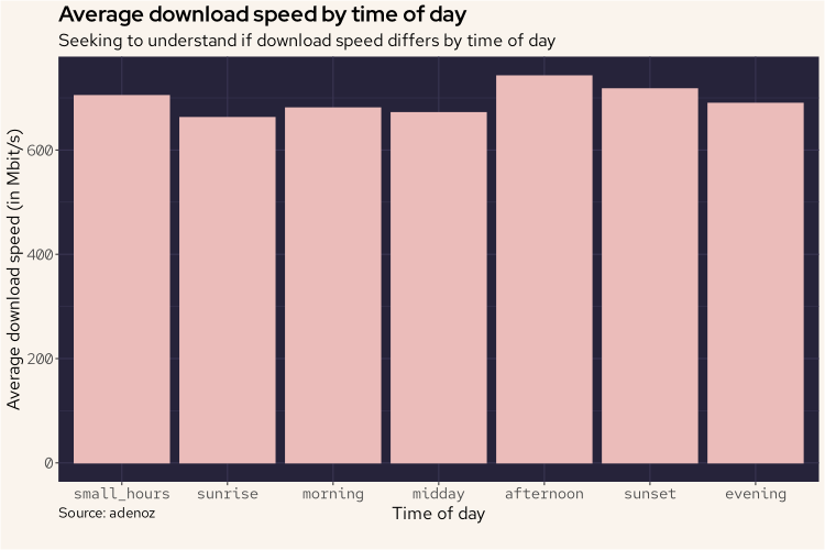
And from the above plot, we can see that there isn't actually any differences of note. Interesting.
Let's do some more digging.
While we haven't really found anything of note looking at the download readings over time, or by time of day, let's combine both aspects into a tile plot to see if we can find anything significant. I remain interested in understanding more about those low readings from the histogram plots.
df |>
  group_by(daily = floor_date(Timestamp, "day"), day_period) |>
  summarize(speed = mean(Download / 1000000)) |>
  mutate(day_period = factor(day_period, levels = c("small_hours", "sunrise", "morning", "midday", "afternoon", "sunset", "evening", "nil"))) |>
  ggplot(aes(daily, day_period)) +
  geom_tile(aes(fill = speed)) +
  scale_fill_gradient(low = "#191724", high = "#ebbcba") +
  labs(title = "Average download speed by time of day",
       subtitle = "Measuring average download speed, each day, by period of day, in Mbit/s",
       caption = "Source: adenoz",
       x = "By day",
       y = "Time period of day") +
  adenoz_theme
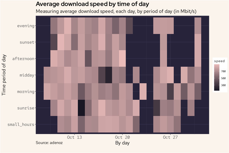
And the above plot is a little more interesting, however there still isn't any one day or time of day combination or pattern of note. We can see those missing readings around the 23/24th Oct and in the evenings of ~28/29th too. While interesting that we can see when the script was failing to get responses, it doesn't contribute to our understanding of the data that we did collect. We do see that on the 14th (sunrise) and 18th Oct (midday) there were some lower download speeds. Let's look into the 14th to see if there is something going on here.
df |>
    filter(Timestamp > "2025-10-14 00:00:00" & Timestamp < "2025-10-14 23:59:59") |>
    mutate(DL = Download / 1000000) |>
    ggplot(aes(DL)) +
    geom_histogram(col = "#ebbcba", fill = "#ebbcba") +
    labs(title = "Histogram of download speeds on 14th Oct",
         subtitle = "Distribution of download speeds on just the 14th Oct",
         caption = "Source: adenoz",
         x = "Download speeds (in Mbit/s)",
         y = "Count of download speeds") +
    adenoz_theme
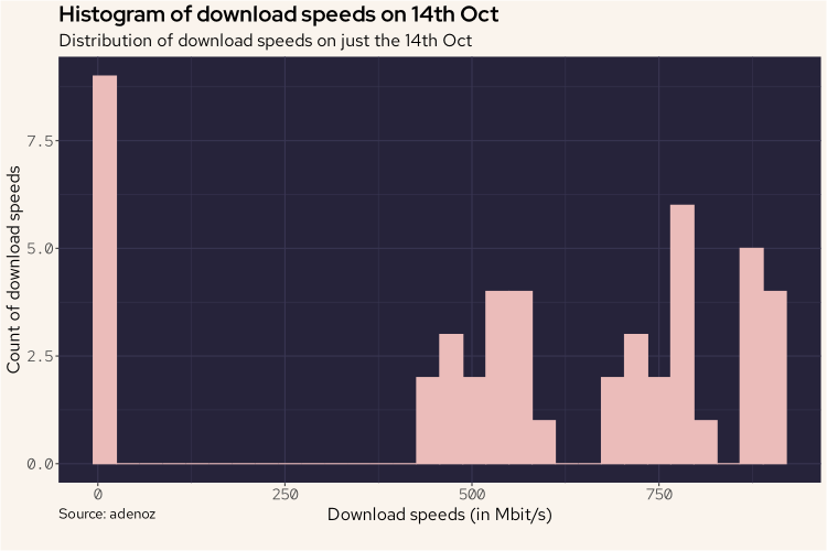
And from the above plot, we do see that relatively higher count of very low readings, but it doesn't account for all of it. Combined with the 18th it might do though. Let's look into this more.
What we'll do next, is we'll plot all download recordings that were below 100 Mbit/s along a timeline to see if this provides us any insights.
df |>
  mutate(DL = Download / 1000000) |>
  filter(DL < 100) |>
  select(Timestamp, DL) |>
  ggplot(aes(Timestamp, DL)) +
  geom_point(col = "#ebbcba") +
  labs(title = "Occurances of download speeds below 100 Mbit/s",
       subtitle = "Seeking to identify further patterns in poor download speeds",
       caption = "Source: adenoz",
       x = "Time of download reading",
       y = "Download speed (in Mbit/s)") +
  adenoz_theme
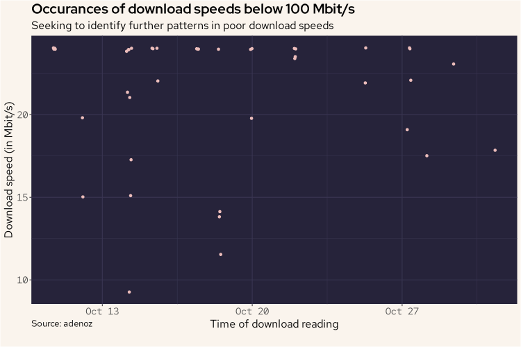
Unfortunately, the above plot doesn't show us too much of note. We do see those lower readings on 14th and 18th, but we knew that already. There are a variety of other readings on this plot too though. Let's look at this sort of data in a different way. We'll count the number of download recordings below 100 Mbit/s that occurred each day and plot that. This may show us a pattern of note.
df |>
  mutate(DL = Download / 1000000) |>
  filter(DL < 100) |>
  group_by(daily = floor_date(Timestamp, "day"), day_period) |>
  summarize(count = n()) |>
  ggplot(aes(daily, count)) +
  ylim(0, 8) +
  geom_bar(stat = "identity", fill = "#ebbcba") +
  labs(title = "Count of download recordings below 100 Mbit/s",
       subtitle = "Counting occurances of low download speeds by day, looking for patterns",
       caption = "Source: adenoz",
       x = "Day of download recordings",
       y = "Count of occurances of downloads speeds below 100 Mbit/s") +
  adenoz_theme
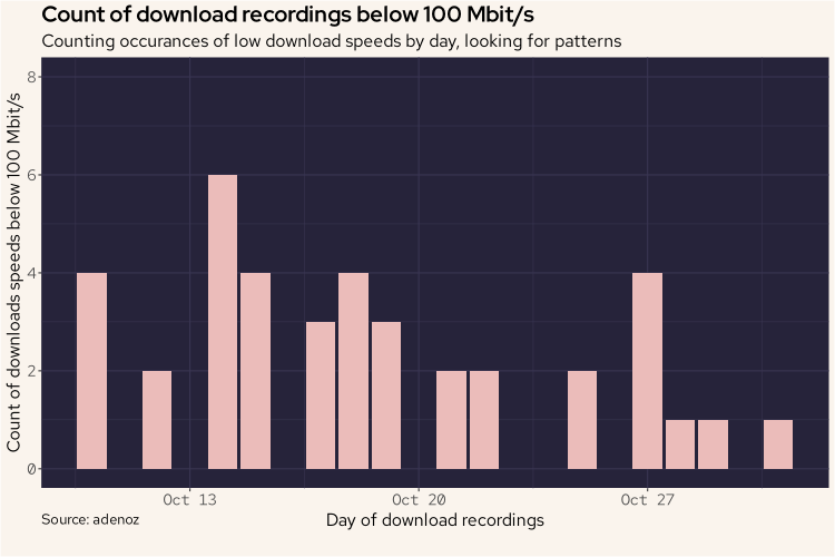
Ok, this is a better plot, but it seems there isn't actually any pattern or standout explanation for those low download speed readings. Perhaps those low readings are just generally spread about randomly at different times? That's not a bad thing I guess?
Let's keep sniffing around.
There is one last thing I'd like to take a look at. It might be worthwhile to look at the readings over time, by Sponsor. In Speedtests, a server / sponsor is selected that should be the best one for the time each test is run. I imagine any issues with different servers / sponsors will average out over time, but let's look at this anyway, just to be sure.
df |>
    group_by(hour = floor_date(Timestamp, "hour"), Sponsor) |>
    summarize(avg_dl = mean(Download / 1000000)) |>
    ggplot(aes(hour, avg_dl, col = Sponsor)) +
    geom_line(linewidth = 0.8) +
    labs(title = "Internet download speed over time, by Sponsor",
         subtitle = "Looking for differences in download speed recordings by Sponsor",
         caption = "Source: adenoz",
         x = "By hour, over time",
         y = "Average download speed (in Mbit/s)") +
    adenoz_theme
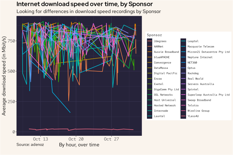
Wow. Ok. I think we have found our problem. While the above is a messy plot, there is one clear standout being that bottom line all the way down there on its lonesome. The noise above isn't really relevant.
That line looks like it's from YLess4U. Let's look into this some more.
df |>
    filter(Sponsor == "YLess4U") |>
    group_by(hour = floor_date(Timestamp, "hour"), Sponsor) |>
    summarize(avg_dl = mean(Download / 1000000)) |>
    ggplot(aes(hour, avg_dl, col = Sponsor)) +
    geom_line(linewidth = 0.8) +
    labs(title = "Internet download speed over time, from YLess4U",
         subtitle = "Looking at download speeds for only YLess4U readings",
         caption = "Source: adenoz",
         x = "By hour, over time",
         y = "Average download speed (in Mbit/s)") +
    adenoz_theme
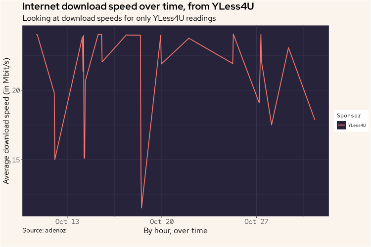
Yes. That is YLess4U. I think we've found our problem. It appears that it is the readings from YLess4U that is bringing down the download speed readings.
To finish off, I might just do one more histogram of all of the download speed readings again, though without YLess4U. This should result in a better histogram with no more bump at the bottom with readings close to zero.
df |>
    mutate(DL = Download / 1000000) |>
    filter(Sponsor != "YLess4U") |>
    ggplot(aes(DL)) +
    geom_histogram(col = "#ebbcba", fill = "#ebbcba") +
    labs(title = "Histogram of download speeds without YLess4U",
         subtitle = "Distribution of download speeds, looking for other significant issues",
         caption = "Source: adenoz",
         x = "Download speeds (in Mbit/s)",
         y = "Count of download speeds") +
    adenoz_theme
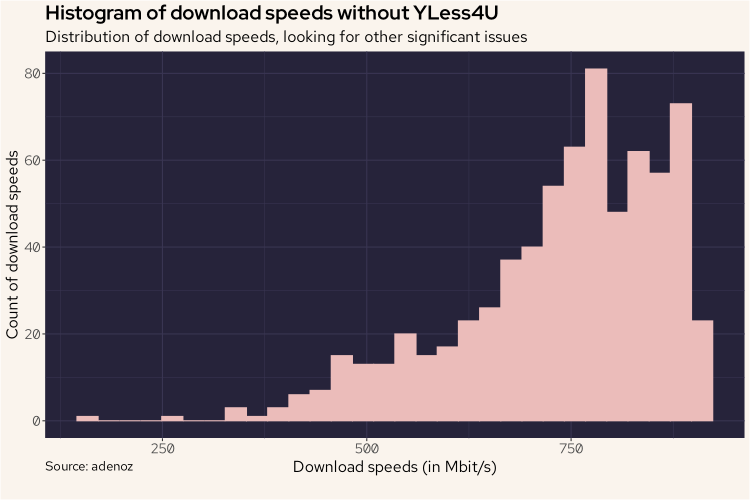
And there we go. We've confirmed that the issue is all to do with speedtest-cli choosing YLess4U to run tests, not issues relating to my actual internet service having semi-regular download speed drops. That's nice to know. And it was a fun little data project too!
Conclusion
I guess I could be upset at that histogram tail that does slope down with numerous reading far below my theoretical maximum speed of 1Gbit/s, but overall I'm content. It's important to note that the final histogram above, even though it removes readings from YLess4U, doesn't represent my actual internet download speed. It represents the download speeds recorded by speedtest-cli using one of the selected servers. So the data isn't perfect, but overall I think it does provide a reasonable insight into my internet service, after removing obvious poor sources.
Well, that was fun! We got to play around a bit with nushell, speedtest-cli and cron to build a nice little dataset of relevance. We used duckdb to interactively explore our csv file with SQL for rapid and easy insights. And we dived into r and played around with the fantastic ggplot library to visually explore our data in various ways which all ultimately led me to better understand my internet service, and also the speedtest-cli tool.
What is your internet service like? Is it worse on certain days of the week or certain times of day? How would you know if you haven't seen any data? Now you know a fun way for how to find out!
📌 Post tags: nushell duckdb r cron ggplot